Feature | Flexible sized grid items in new Builder
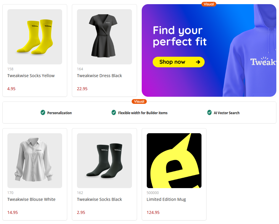
It's finally here: flexible sized grid items! As engagement with your customers is crucial and becoming a key indicator on how well you perform, a default grid layout where all of your item-tiles are same in size does not help you. So our Builder now has been completely rebuilt and expanded with new functionality. Most important one? The option to determine width-spans (height-spans will follow later) of all of your components, making full-width promotion banners or USP-bars finally possible!
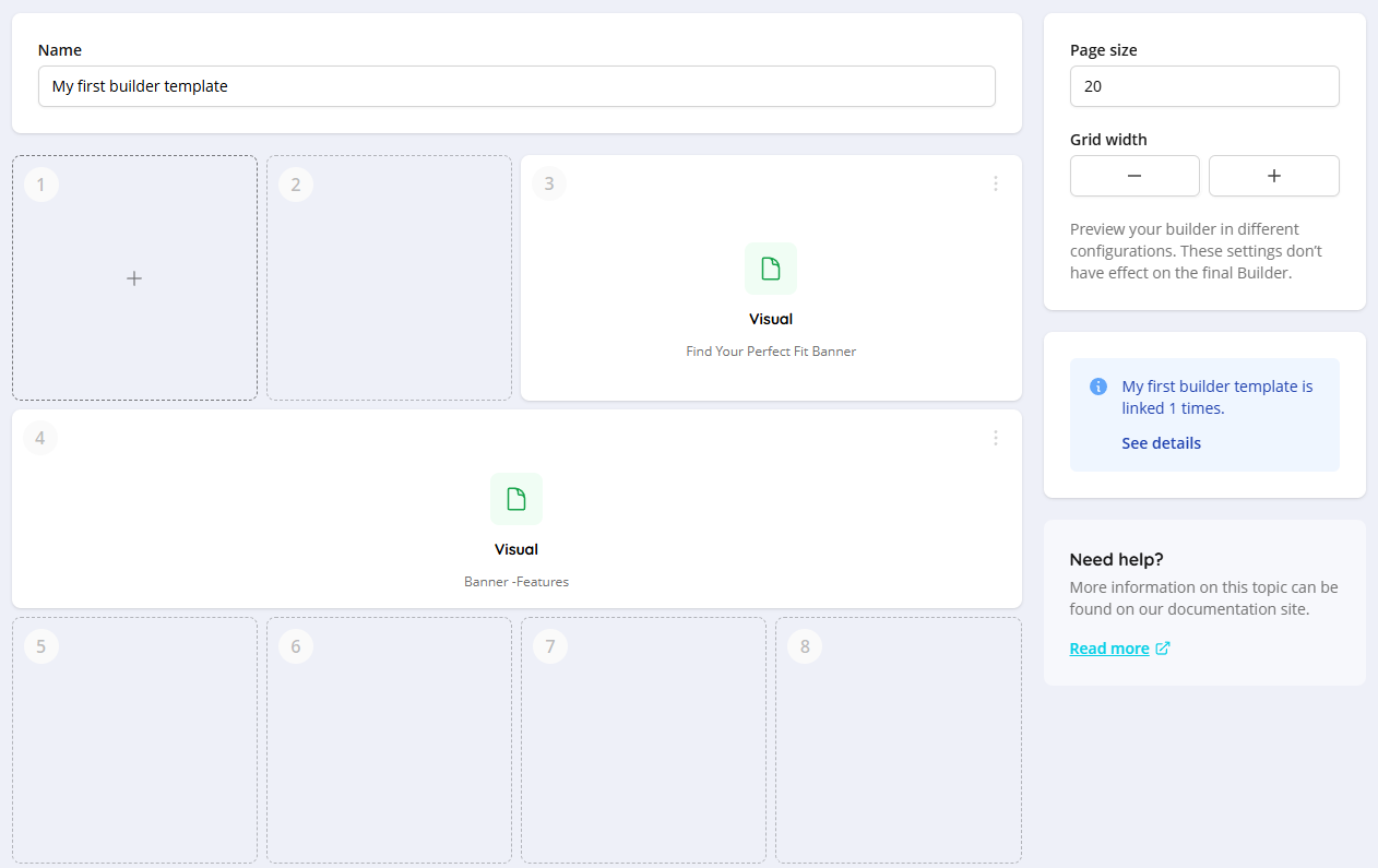
For experienced users, some important things have changed. Your list of components is completely removed from the left side of the builder. However, you will see all available components and simply select one, once you click on an empty or free spot in your builder. You can also change the grid with of the builder, giving you an instant visual representation of how your configuration will look like in a different (viewport) setup. Unfortunately, at the moment it is not possible to make a different setup for desktop and mobile viewports in one builder template.
New Builder: ExperimentalThe Builder has been completely rebuilt and is available for everyone. If you want to use and experiment with it, click on your avatar in Tweakwise App and make sure the feature 'New builder' is toggled on. If you don't see the toggle in your instance, please reach out to your Customer Success Manager or Tweakwise Support.
Width-span settings
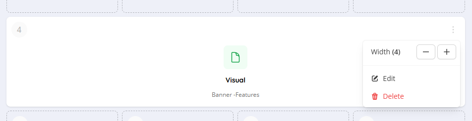
In order to have a component span multiple columns of the grid, you now have the possibility to configure the width of the entire component, no matter if it's a product or non-product component. You can simply set the amount of tiles your component should use and will instantly see how this will reflect your layout. If you configure a component to be larger than the total width of the row, it will take up the full row as it maximum size.
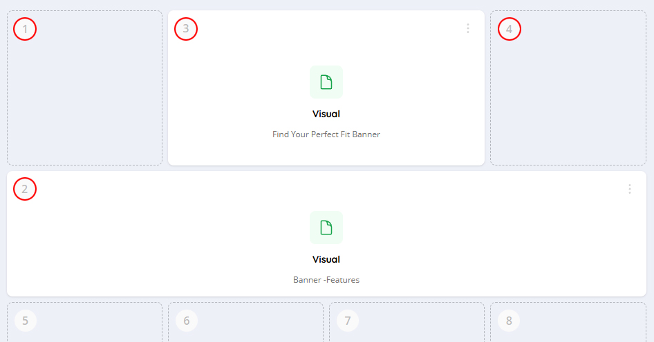
If there is no space for your component (for example if a spot is already claimed by another component), we will position your component on the first available spot. All empty spots will be filled up by, so there is always a full row with items available. This could lead to some reshuffling of the order of your components, but keeping your layout setup in place. In the example below, you see the full-width configured component marked with position 2 does not fit on that particular spot (because of its width settings) and therefore moves to the first available spot. The available space (initial spots 2, 3 and 4) are now filled in by the configured components 3 and 4.
Implementation
If you make use of our JavaScript implementation, all functionality is covered out of the box. For API-implementations, you do have to make changes to your frontend code yourself as our Frontend API now just support hints to allow the display of different width and height spans of your Builder components. A full implementation guide on this can be found in this article.