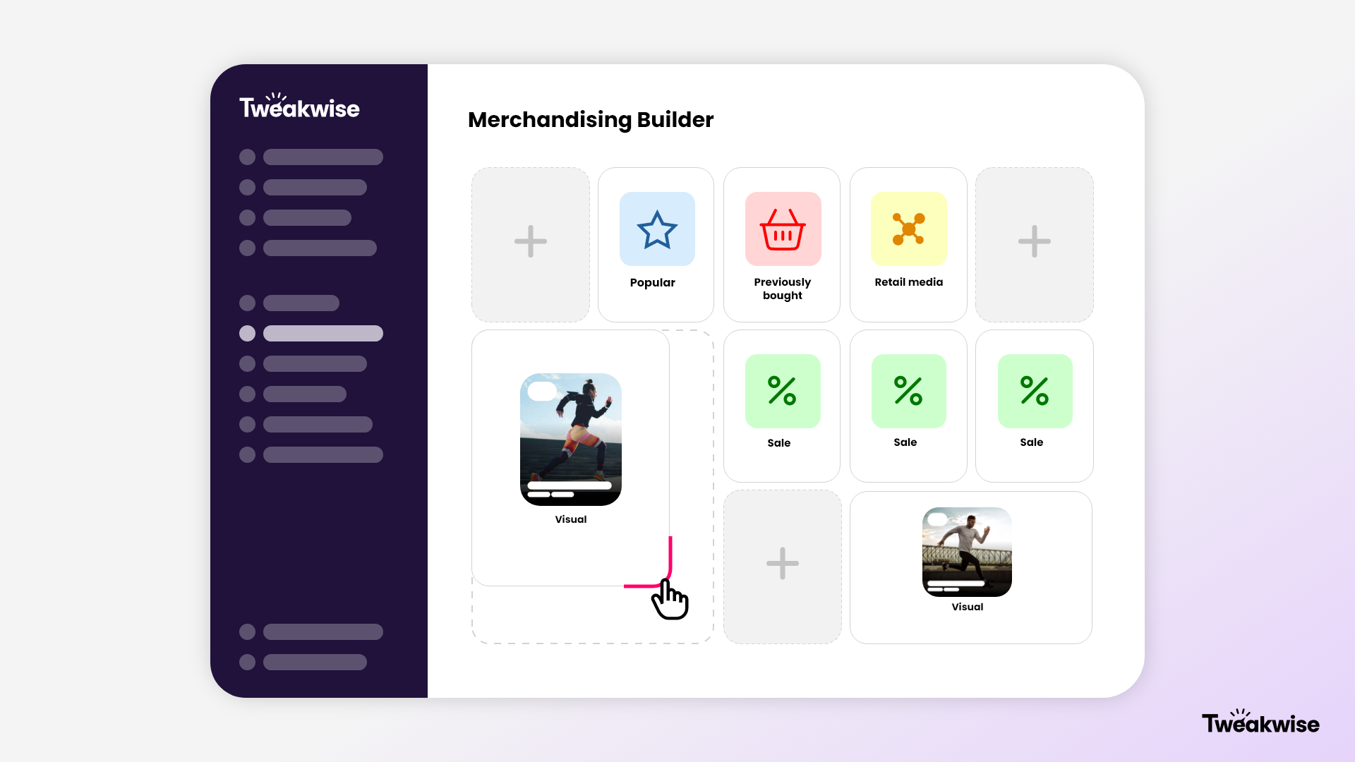
Flexible Sized Grid Items
Flexible Sized Grid Items give you complete control over the layout of your product listing pages. With this feature, you decide how wide and tall individual product tiles and visuals appear. Highlight a bestseller across two columns, stretch a campaign banner across a full row, or make a set of USPs stand out by spreading them across multiple rows. Everything is configured directly inside the Merchandising Builder, no developers, no custom code.
The result is a dynamic and visually engaging product grid that captures attention and guides shoppers toward the products that matter most. Shoppers see the changes instantly, while you stay in full control of the experience.
Introduction
Builder components support hints to allow the display of different width and height spans of your components. This will make it possible to create a more dynamic product grid. For example display a product over two columns, display a full row of usp's or put a visual over multiple columns & rows.
Implementation
Use the visualproperties colspan and rowspan hints, and translate them to your layoutsystem to display the components as desired.
<items>
  <item>
    <itemno>100012674</itemno>
    <type>product</type>
    <title>Tweakwise Hoody Colin</title>
    <!-- -->
    <visualproperties>
      <colspan>1</colspan>
      <rowspan>1</rowspan>
    </visualproperties>
  </item>
</items>
Recommendations
- Use CSS Grid as layout system for your items.
- Use
grid-column-start:span {colspan};andgrid-row-start:span {rowspan}to make sure your items is spanning the correct amount of columns. - Use
grid-auto-flow: dense;to allow the grid to flow in a nice way automatically. This behaviour is also visible in the demoshop.
- Use
- For images or visuals, consider setting the
aspect-ratioto make sure the images are displayed in the correct ratio.
Example
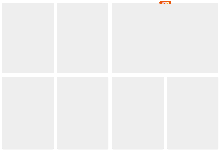
As an example, this 4 column grid with a visual that spans two columns:
<style>
  /* 4 column grid */
  .grid {
    display: grid;
    grid-template-columns: repeat(4, minmax(0, 1fr));
    grid-auto-flow: dense;
    gap: 1rem;
  }
</style>
<div class="grid">
  <div>Product</div>
  <div>Product</div>
  <div style="grid-column-start:span 2;grid-row-start:span 1;">Visual</div>
  <div>Product</div>
  <div>Product</div>
</div>
Would result in this layout:
Notes
- Currently we support one set of hints that can be interpreted as desired. This could be expanded in the future.
- Think about how this behaviour should translate to mobile or tablet devices. Currently we support one set of hints that can be interpreted as desired. In the future this might be expanded.
- In case you're using Tweakwise JS: set useCssGridForItems to true.