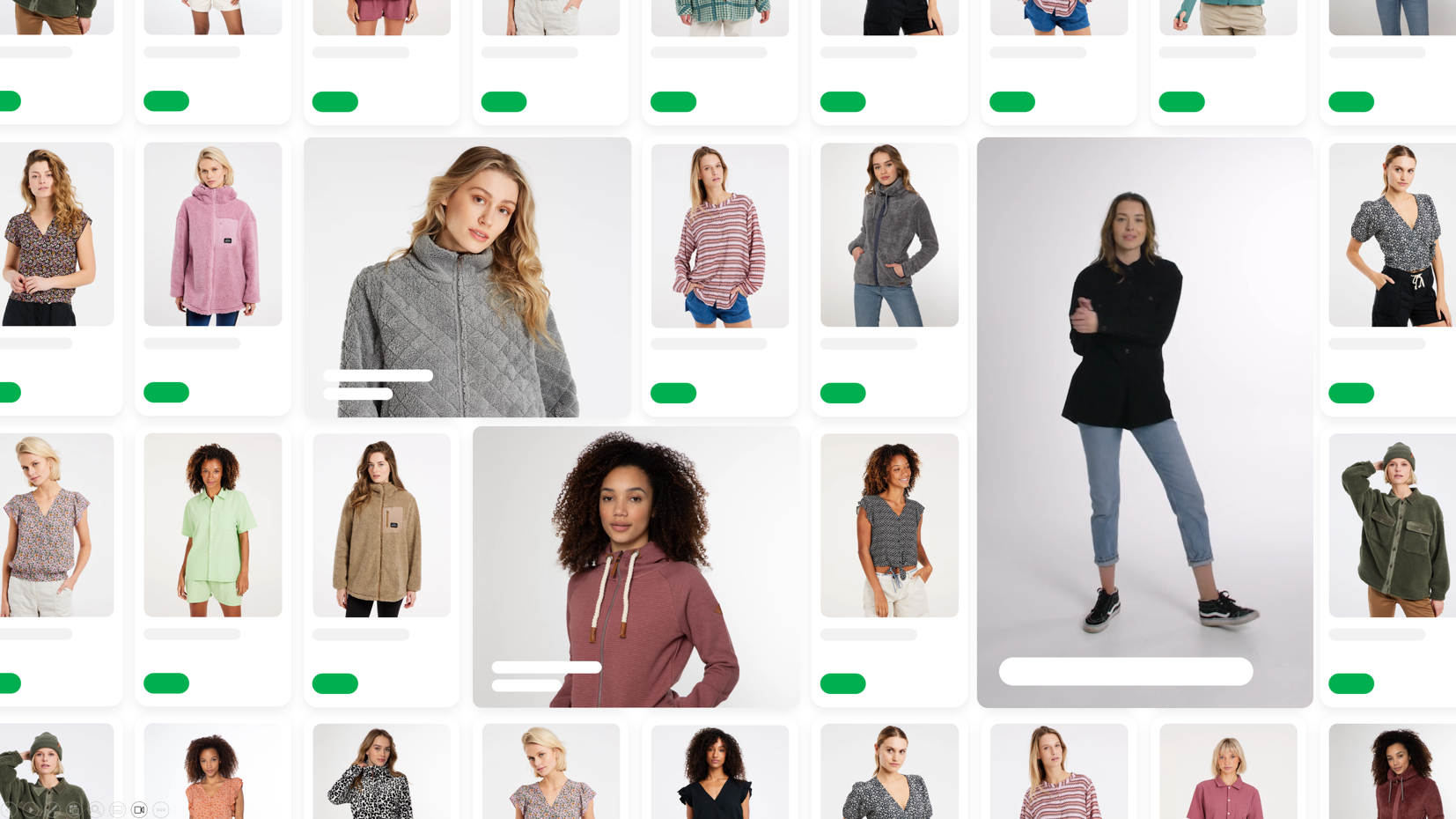
Visual in lister pages
Visual Components brings a new layer of inspiration to your lister pages. You already have great product photos, lifestyle images and branded content, so why hide them on static campaign pages? With Visual Components you place them exactly where visitors look the most: inside their shopping flow. It blends products and content into a dynamic experience that feels more relevant and converts better.
In a competitive market, strong content helps you present your assortment in a unique and engaging way. You highlight campaigns, bestsellers, trends or brand stories right between your products. It is faster, smarter and more effective than traditional static layouts.
With the Builder you set everything up yourself. No developers, no delays. Launch new visuals, test variations, tweak your layout and instantly see the impact. Visual Components lets you create a shopping experience that feels alive, evolves continuously and perfectly fits your brand identity.
Introduction
In Tweakwise, visuals are conceptually the same as products. This means this is not just limited to types of visual but any time of content. Include your desired content items in your existing product feed or create a seperate feed.
Before you begin
Before implementing, think about these topics:
- Where will the data come from?
- What do you want to display and how?
- Is there a difference between mobile vs desktop?
- Determine image ratios, to keep a consistent display, these should always be the same.
For more information, read A Deep Dive Into object-fit And background-size In CSS.
Implementation
To make use of visuals, follow these steps:
-
Import the items: append them to your exisiting feed, create a seperate feed or make use of our Channable Channel.
-
Add an item-type attribute to the feed: add a specific attribute to store the item type, e.g., item_type.
<item> <id>promo-2024-04-garden</id> <name><![CDATA[Inside out]]></name> <image><![CDATA[https://sttweakwisecustomized.blob.core.windows.net/content/shop/banner-freeshipping.png]]></image> <url><![CDATA[https://www.tweakwise.com/]]></url> <stock>0</stock> <price>0</price> <attributes> ... <attribute> <name>item_type</name> <value><![CDATA[visual]]></value> </attribute> ... </attributes> </item> -
Configure the attribute as type characteristic: so the front-end API can use it in the type field:
{
  "type": "visual",
  "itemno": "banner-freeshipping",
  "title": "Free shipping Banner",
  "image": "https://sttweakwisecustomized.blob.core.windows.net/content/shop/banner-freeshipping.png",
  "url": "https://www.tweakwise.com/",
  "attributes": []
}
<item> <type>visual</type> <itemno>banner-freeshipping</itemno> <title>Free shipping Banner</title> <image>https://sttweakwisecustomized.blob.core.windows.net/content/shop/banner-freeshipping.png</image> <url>https://www.tweakwise.com/</url> <attributes/> </item> -
Differentiate when rendering: When rendering the page, you can differentiate based on the type attribute to display either a product or a visual tile.
Sizing & scaling
Instead of embedding text and buttons directly into the visual image, you can define those as seperate elements. This allows for better scaling, improved readability, and a more consistent user experience on various screen sizes.
For the best results, we recommend:
- Create clean, square images without text, displayed using
object-fit: cover(link) - Add supporting text/buttons as attributes and expose them in the Delivery API
- In your frontend, display the text/buttons in your visual tile on top of the image (for Tweakwise JS, see notes)
Notes:
- For Tweakwise JS support, go to Tweakwise JS - Modify visual tile and Tweakwise JS - Add responsive support to visuals.
- An alternative is to display these items at full width on mobile, which would eliminate any scaling issues. However, it's important to ensure that there are always at least two items on the page; otherwise, you might end up with a "gap" at the end of your list.
Responsive/mobile support
If you want to display different images on mobile and desktop, provide alternative images in the attributes:
<item>
  <id>promo-2024-04-perfect-fit</id>
  <name>Find your perfect fit</name>
  <image><![CDATA[https://cdn.tweakwise.com/content/shop/findyourperfectfit.png]]></image>
  ...
  <attributes>
    ...
    <attribute>
      <name>image_mobile</name>
      <value><![CDATA[https://cdn.tweakwise.com/content/shop/findyourperfectfit_mobile.png]]></value>
    </attribute>
    ...
  </attributes>
</item>
Then:
- Expose the attribute in the API response.
- In your frontend, use the correct image on the respective device width.
Notes:
- For Tweakwise JS support, go to Tweakwise JS - Modify visual tile and Tweakwise JS - Add responsive support to visuals.
Flexible width & height support
If you want to display your visual on different column spans, see Flexible width for Builder items.
Why do I need this?
But I can do this myself using Storyblok! Yes, you could. You could solve this within your platform but you'll quickly run into issues.
Suppose you have 24 items on a page, 3 products per row. If you want to display one visual on a page, you'll end up with a "gap" of 2 tiles at the end of the page because you now have 13 items. Pretty ugly but the customer may think there are no more products in that category. On subsequent pages, this problem will only get worse.
In the end, you want to solve this issue in one central place. That's the big advantage that Tweakwise offers: we ensure that the position of such an element is fixed within the grid. No issues with gaps or paging.
Because Tweakwise is highly flexible with content, we actually complement Storyblok very well. Storyblok serves as the source for your visual/content blocks, which can be imported separately via a content feed.
Support
Currently we support the following platforms out of the box:
Magento
- Magento2Tweakwise v8.1.0 and higher
- Magento2TweakwiseHyva v4.1.0 and higher
Tweakwise JS
All Tweakwise JS implementations that run on Plugin Studio are ready to use visuals.
Currently we support one image for all breakpoints, an alternate image for desktop/mobile is not supported.
Troubleshooting
If your platform supports items other then products, and it is not showing up in your lister pages, there are a couple of things to check.
Magento < 8.4.2
- Merchandising Builder > Enabled: Yes.
The Merchandising Builder section is only visible when Ajax Filtering is on. - Layered navigation > Ajax Filtering: Yes.
The Merchandising Builder section is only visible when Ajax Filtering is on. - Enable Varnish
Varnish is required for Builder.
Updated 3 months ago