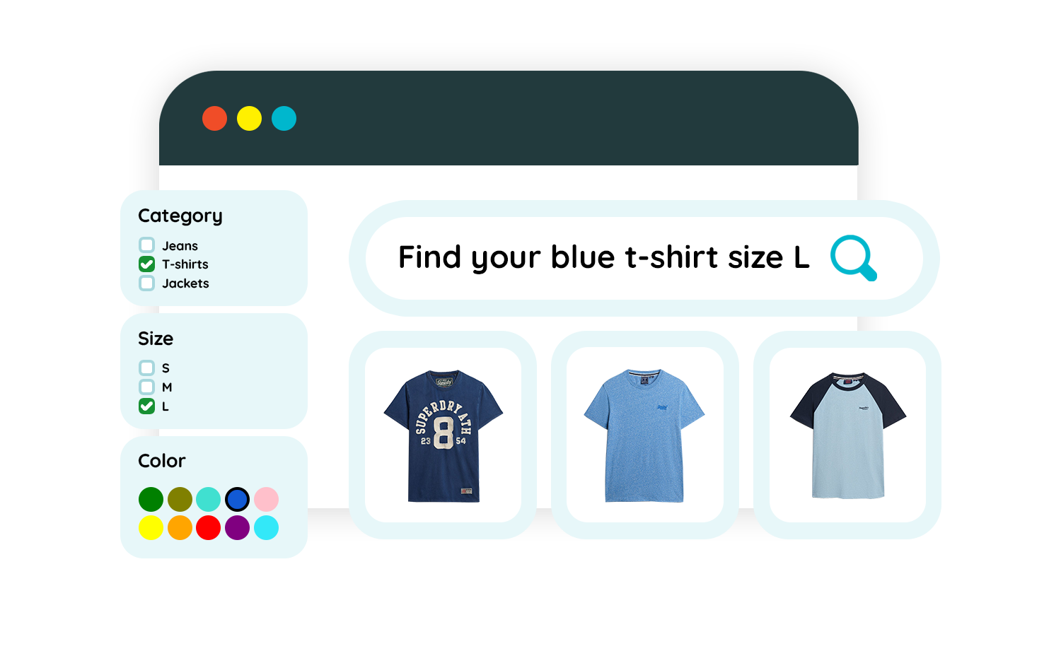
Example: usage of facets and filters in the left column
DefinitionFaceted search, also known as faceted filtering or faceted navigation, is a function in online shops that helps users refine results by applying filters from product attributes. Filters enable one-dimensional narrowing of results, for example by brand or color. Faceted search, on the other hand, includes multiple filters simultaneously, allowing users to apply several product characteristics at the same time, in this case, brand and color. This makes faceted search especially helpful for large assortments with many product characteristics.
Settings
The implementation of a facet should be done using the configuration in the facetsettings object:
title: the title that is displayed on top of the faceturlkey: the key that is used to identify the facet, we recommend using this slug in your URL structure.iscollapsibleandiscollapsed:iscollapsible: indicator if the facet should be allowed to collapseiscollapsed: controls the default collapsed state of the facet
nrofshownattributes,expandtextandcollapsetext, see Limiting filtersshowselectedfirst: indicator if the selected filters should appear on top of the list (we do this for you)ismultiselectandmultiselectlogic, see Multiselectselectiontypesee Selection typeisnrofresultsvisible: indicator to show the preview of the number of results when selecting a filterisinfovisibleandinfotext, see Hints and tooltipsissearchable,searchplaceholderandsearchnoresultstext, see Search within filters →.prefixandpostfix: see Formattingcssclass: see Formattingsource, see Sources
Implementation
Using the facet settings, render the list of facets using the facetsettings object. For each facet, display the available filters in the facet.attributes array using selection type.
<attributes>
  <attribute>
    <title>Sale</title>
    <isselected>false</isselected>
    <nrofresults>5</nrofresults>
    <attributeid>1009</attributeid>
    <url><![CDATA[ ?tn_cid=1000-1009 ]]></url>
    <link><![CDATA[ /navigation/{instancekey}/1000?tn_cid=1000&tn_fk_campaign=Season%20Sale ]]></link>
    <children/>
  </attribute>
{
"title": "Sale",
"isselected": false,
"nrofresults": 5,
"attributeid": 1009,
"url": "?tn_cid=1000-1009",
"link": "/sale",
"children": null
}| title | description |
|---|---|
| title | the text to show on the filter. Can be used in combination with facetsettings.prefix and facetsettings.postfix. |
| isselected | Indicator if the filter is selected/active |
| nrofresults | the number of results that when the filter is activated, use in combination with facetsettings.isnrofresultsvisible |
| attributeid | can be used as unique identifier for this value |
| url | exists for legacy reasons, could be used to parse or use directly in PoC |
| link | if a SEO-friendly URL is provided in the feed or backend api this property will be populated with that value. |
| children | In case of source = tree, a filter can have child attributes. |
Alternate sort order
Rendering of the items should be done in the order they appear in the list. If the user is expanding the list (see Limiting filters), use the value of attribute alternatesortorder to sort the list:
<attributes>
  <attribute alternatesortorder="1">
    <title>Sale</title>
    <isselected>false</isselected>
    <nrofresults>5</nrofresults>
    <attributeid>1009</attributeid>
    <url><![CDATA[ ?tn_cid=1000-1009 ]]></url>
    <link><![CDATA[ /navigation/{instancekey}/1000?tn_cid=1000&tn_fk_campaign=Season%20Sale ]]></link>
    <children/>
  </attribute>
  <attribute alternatesortorder="0">
    <title>Sale</title>
    <isselected>false</isselected>
    <nrofresults>5</nrofresults>
    <attributeid>1009</attributeid>
    <url><![CDATA[ ?tn_cid=1000-1009 ]]></url>
    <link><![CDATA[ /navigation/{instancekey}/1000?tn_cid=1000&tn_fk_campaign=Season%20Sale ]]></link>
    <children/>
  </attribute>
</attributes>
[{
"title": "Sale",
"alternatesortorder": 1,
"isselected": false,
"nrofresults": 5,
"attributeid": 1009,
"url": "?tn_cid=1000-1009",
"link": "/sale",
"children": null
},
{
"title": "Sale",
"alternatesortorder": 0,
"isselected": false,
"nrofresults": 5,
"attributeid": 1009,
"url": "?tn_cid=1000-1009",
"link": "/sale",
"children": null
}]Selection type
Available selection types:
- checkbox: filter results with multi-select checkbox
- link: filter results with single-select links
- tree: filter results with single-select links in a tree structure, see Categories.
- color: filter results using color swatches, see Color swatches →.
- slider: filter results using linear slider, see Slider →
{
  "navigation": {
    "facets": [
      {
        "facetsettings": {
          //...
          "selectiontype": "link", // Type of selection for this facet
          //...
        }
      }
    ]
  }
}
<navigation>
<facets>
<facet>
<facetsettings>
...
<selectiontype>link</issearchable>
...
</facetsettings>
...
</facet>
</facets>
...
</navigation>*Only available when facet source is category.
Hints and tooltips
If a facet needs more explanation or help text, infotext can be used to display a hint.
isinfovisible: indicator if the facet should display a hintinfotext: the hint text to display
Limiting filters
Sometimes there are too many filtering options within a facet to display them all.
You may need to limit the list and add a "show more" link.
nrofshownattributes: indicator what amount of filters should be visible in this facetexpandtext: option to show a "show more" linkcollapsetext: option to replace the "show more" with a "show less" link that will hide the previously options again.
Another popular way to achieve a similar result is to offer search within a facet. See Search within filters →.
Formatting
prefix and postfix give the option to add prefix or postfixes to facets or filters. Mainly used in filtertype slider, where they indicate the bounds labels. For example: a price slider can have a currency prefix or a "number of monkeys" slider might have a "monkeys" postfix.
With faceted navigation, facets are usually rendered in a generic way. Add the value of cssclass to your facet.
Sources
Possible values are FEED, AFGELEID or CATEGORY.
This can be used to determine if a facet is actually a special type of category facet, see Categories →.