When dealing with attributes that contain many options (like Brand or Color), scrolling through a long list of checkboxes is a poor user experience. The Search within filters (or Facet Search) feature allows your users to filter the available values of a specific facet using a text input.
This document answers how to enable this feature in the Tweakwise App and how to handle the resulting data in your frontend implementation via the API.
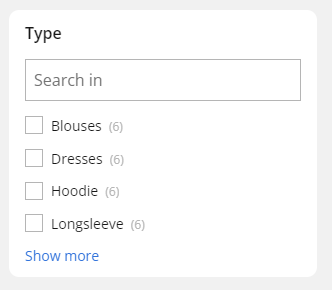
Display a searchbox on top of facet filters
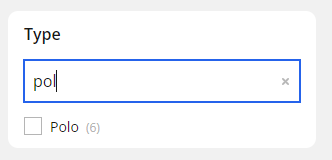
When typing, the facet filters items are filtered
Read our product guide on how to configure the Search within filters in detail.
Implementation
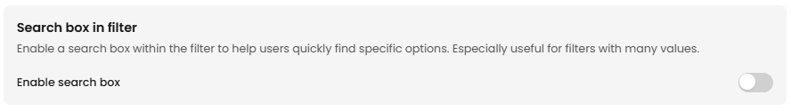
1. Enable in Tweakwise App
First, you must define which attributes should support internal searching.
- Go to the Tweakwise App.
- Navigate to Filtering > Filtertemplates.
- Open the filtertemplate that contains the attribute you want to enable search on.
- Select the filter you wish to edit (e.g., Brand).
- Locate the Search box in filter and enable it.
Publish your changes to push the configuration to the API.
2. Frontend integration
Once enabled, the Delivery API will return additional metadata for these specific facets.
- issearchable: true/false boolean to indicate if search is available within the facet
- searchplaceholder: placeholder text for the facet search
- searchnoresultstext: text for when there are no results for the facet search
{
  "navigation": {
    "facets": [
      {
        "facetsettings": {
          "issearchable": true, // boolean to indicate if search is available within the facet
          "searchplaceholder": "Placeholder text for the facet search",
          "searchnoresultstext": "Text for when there are no results for the facet search"
        }
      }
    ]
  }
}
3. Frontend logic
When issearchable is true, your frontend should render a search input field at the top of that specific facet.
No extra API request should be made for this search, as all information (filter values) is available in the given API response already. The actual search behavior should be executed client-side.
Example
Implement the actual searching using a dedicated, lightweight library like Fuse.js or a DIY approach if you need more control or a lightweight custom solution:
<template>
    <div v-if="isSearchable" class="relative mb-4">
        <input v-model="searchTerm" :placeholder="searchPlaceholder"
            class="block w-full rounded-md border-0 py-1.5 text-gray-900 shadow-sm ring-1 ring-inset ring-gray-300 text-sm placeholder:text-gray-400 focus:ring-2 focus:ring-inset focus:ring-primary sm:leading-6" />

        <XMarkIcon v-if="searchTerm" class="absolute m-auto mr-2 inset-0 text-gray-400 size-6 cursor-pointer"
            @click="searchTerm = ''" />
    </div>

    <template v-if="searchTerm && visibleAttributes.length === 0">
        <div>{{ noResultText }}</div>
    </template>

    <div class="space-y-3">
        <div class="flex relative items-center" v-for="attribute in visibleAttributes" :key="attribute.attributeid">
            <span :class="['text-sm text-gray-600', attribute.isselected && 'font-semibold']">
                {{ attribute.title }}
            </span>
        </div>
    </div>
</template>

<script lang="ts" setup>
import { computed } from 'vue';
import { XMarkIcon } from '@heroicons/vue/20/solid';

const props = defineProps<{
    facet: IApiNavigationFacet;
}>();

const searchTerm = ref<string>('lo');

const isSearchable = computed(() => {
    return props.facet.facetsettings?.issearchable ?? false;
})

const searchPlaceholder = computed(() => {
    return props.facet.facetsettings?.searchplaceholder ?? '';
})

const searchAttributes = computed(() => {
  if (!searchTerm.value) return props.facet.attributes;

		const processedSearchTerm = normalize(searchTerm.value.trim());

    return props.facet.attributes.filter((attribute) => {
        const processedAttributeName = normalize(String(attribute.title).trim());
        return processedAttributeName.includes(processedSearchTerm);
    });
});

const visibleAttributes = computed(() => {
    const amount = props.facet.facetsettings?.nrofshownattributes;
    const attributes = searchAttributes.value;

    if (!searchTerm.value) {
        return attributes?.slice(0, amount);
    }
    return attributes;
});

const noResultText = computed(() => {
    return props.facet.facetsettings?.searchnoresultstext ?? '';
})

</script>
Notes & Important Considerations
- Attribute Type: This feature is most effective for "Multiple Selection" (Checkboxes) or "Single Selection" (Radio buttons) filter types. It is generally not applied to sliders or range filters.
- Performance: Enabling search on every single filter can clutter the UI. Limit this to high-cardinality attributes where users are likely to know exactly what they are looking for.
- Case Sensitivity: Tweakwise's internal matching for facet options is case-insensitive, ensuring a smoother experience for your users. The example also uses a normalize function to support a search with diacritic and special character support
function normalize(str: string): string {
	// make sure the search works for characters with accents, etc
  const fallbackMap = {
    'ß': 'ss',
    'Æ': 'AE', 'æ': 'ae',
    'Ø': 'O', 'ø': 'o',
    'Œ': 'OE', 'œ': 'oe',
    'Þ': 'Th', 'þ': 'th',
    'Đ': 'D', 'đ': 'd',
    'Ł': 'L', 'ł': 'l',
    'Ħ': 'H', 'ħ': 'h'
  };

  return str
    .normalize('NFD')
    .replace(/\p{Diacritic}/gu, '')
    .split('')
    .map(char => fallbackMap[char] || char)
    .join('')
    .toLowerCase();
}